
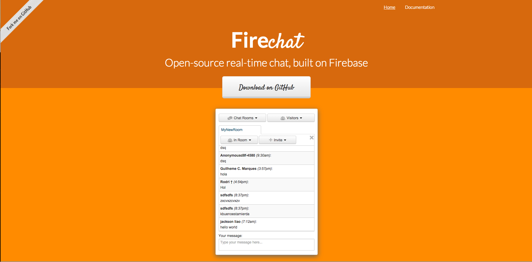
In Part 1, we had an overview of design. Now that we have some of the basic principles down, we can start designing our application. In this project we are going to be creating a chat application using Firechat. When you initially download the chat, your application will look this:
Our goal this week will be to cutomize the chat to make it your own. We will do this by wireframing. Think about how you want the layout to look. For example, in the default Firechat, the Chat Rooms, Visitors, and current room you are in are all dropdown menues, which adds a barrier for the user to know where they are, who they are talking to and what their options are, conversly, Slack keeps all this information on their left side bar:
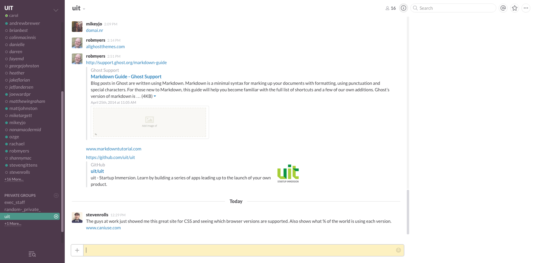
Slack uses a color to indicate who is available, and the current room that you are in rather than having .
Before we start delving into UI, we need to think about the vision. What do you want to be building? Who are you building it for? Will it be for a business, or an individual? Is it crisp and clean, or fun and whimsical?
Now that you have an idea and overall vision of what your chat application will look like we will start wireframing! But just before we begin, there are a couple of key design tips I want to touch on that I think can drastically improve your UI.
Details to Think About
There are five really key factors to think about when you are starting your wireframe: Color, Typography, Use of White Space, Sound and Icons. In this post I'm going to focus on the first three.
1) Color - Colors already have meaning and conventions associated with them, and evoke different feelings. Learn about what to use, what works well together, and Color Psychology.
You will probably choose 2 or 3 core colors for your application, but it is also really key to think about what you want your neutral colors to be. For example, I love that Slack has the time in a grey instead of a black, it makes it the name line less confusing but if I want to access the time information, it is no effort. It is present without being disruptive. Similarly, the unavailable people in the chat, I like that they are empty grey circles rather than solid red ones. Red draws your attention, whereas the grey is passive and unobtrusive.
Great resources for color palettes:
50 Beautiful Color Palettes
Play with colors
2) Typography - Especially with a chat application where the content will mainly be text, it is exteremly important to think about your typography. You want to encourage the user to keep reading, this should be enjoyale and light. Use different fonts, sizes, weights, line heights and colors to create a heirarchy of relavence.
Typography in ten minutes, is a great resource to get you started on the basic rules of Typography. Because I am a visual learner, I thought it would be good to show you an example of these guidelines at work:
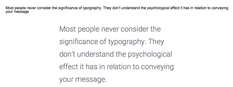
So let's look at the differences between these two typographys:
a) Font Type, Size, Color and Weight:
Choose a beautiful font. Font size is super important. It should be effortless to read your content. Squinting, or enlarging the screen is a barrier to your message getting out there. Fonts on the web should be at least 24px. You can also adjust the weights (thickness of your font), I find choosing a larger size (28-30px), but thinner style makes your content look sleek and more inviting.
Great resources for fonts:
Google Fonts, is a great resource to test, play with and download fonts.
Top 100 Fonts for August 2015, a great list of current trendy fonts.
b) Line Spacing:
This is the distance between lines. It should be 120-145%. In the top example, the line spacing is 100%, meaning that where the top line ends is the same height as where the second line begins. Conversly, the second one has 130% spacing, making it easier and more elegant to read.
c) Line Length (This is also Use of White Space):
This is the width of the text block. Line length should be an average of 45–90 characters per line. I like to think of having the text to be about 35%-50% of the webpage. Haiving the text centered and short width, draws the readers attention to what is important, the content. It also keeps the user interested, as jumping to the next line is exciting and makes them feel like they have accomplished a lot. This positive feedback encourages the user to continue reading.
Now we can get started on wireframing.
comments powered by Disqus