
Design is the way your product looks and feels. It is really important, both to get users interested and to keep users engaged with your application. When I first started, I neglected design, and this was a terrible mistake.
Luckily it makes for a great example of what not to do. Here is an image of one of my first mockups for a social network project:
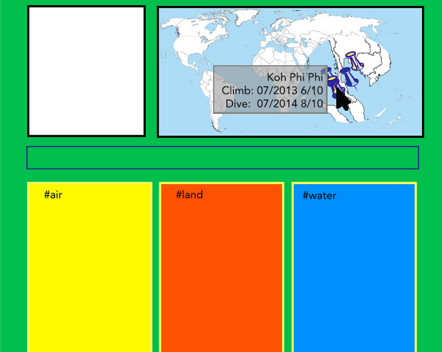
What makes a bad Design?
Yes, this is a huge eye sore, but we can still learn a lot from this. Let's break down just some of the things that make it bad:
1) The colors are way too intense, and hard to look at. Also, the color on the pins don't make sense. Why are some blue and some blue and yellow? Does it correlate to air/water? This is confusing.
2) The size of the pins on the map are too big and it looks like I was using ClipArt (ugh...).
3) It is unclear how to add things to one of the three fields. Do I have to #air before I update my status for it to be put in that column? I created this and I don't know how to use it... That is a bad sign.
So this is a really good example of a shitty design. It is ugly and makes me want to shut it down. There is no clarity on how to use it or why I would want to (which I don't). It is neither inviting or engaging.
Components of Design
We can break design down into two important tasks:
1) User Interface(UI) - How it looks, the visual, the colors
2) User Experience(UX) - How it feels, how much do I want to use this app and does it move in a logical fashion.
Here is a great infographic of the difference between UX and UI designers that Darren MacDonald shared with me:
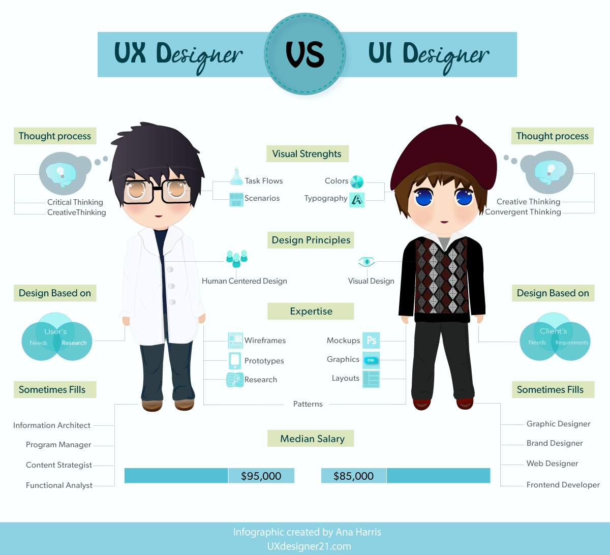
I like to think of Design as a restaurant. With the User Interface being visual: the way it looks when you enter, the colors, the use of space. The User Experience is everything else. It's the diversity of the menu, the service, the flavours, the cleanliness of the bathrooms etc. These two things are definitely dependent on one another.

Even if you loved the look of something you may have had terrible service which ruined your entire night. Equally, everything could be perfect, great service, great food, but it looked like such a dump you didn't even bother to go inside and give it a try.
Good User Experience is really important!
In other words, UX is the process which improves customer satisfaction and in turn, their loyalty. This can be done by easing usability, enhancing pleasure, and customer interact with the product. While UI is purely the make-up, how beautiful something is that makes you want to try it.
UX and UI are dependent on one another and must coordinate to make a solid and satisfying design.
So what is Good Design?
Now that we have seen an example of terrible design, let's look at what is good:
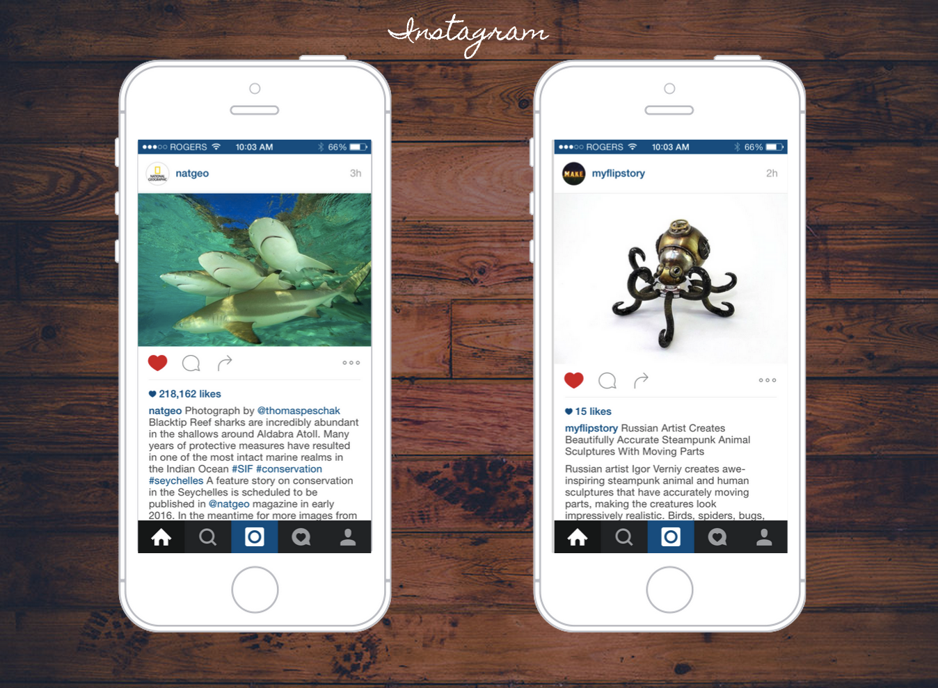
Instagram is a great example of good design. It is simple, informative and makes you want to interact with it. The photos are pretty and make you want to scroll through and see more, the photos are tailored to my interests. Also my attention is intentionally being drawn to the camera button. This entices me to create new content and share it on their app.
Design is important to get users interested and to keep them engaged with your application
You want your design to center around a users feelings, but more importantly you want to have your product evoke feelings. Design helps get users excited to use your application. If users are excited, they are more likely to use it, to return to it and to tell their friends about it.
Some Overarching Principles
1) Rule of Three
:
This is a common rule in almost everything in life, writing, photography, lists. Humans remember things best in threes and it is aesthetically pleasing and comforting. Remember the rule of three while you are designing. Try to keep the number of core colors, display of articles, white space, etc. in threes.
2) Less is Better :
Having less forces the user to concentrate on the most important aspects of your application. You want to make your application intuitive. A Google study found that “visually complex” websites are rated as less beautiful than their simpler counterparts. Read more about this study and the importance of simplicity here: Why “Simple” Websites Are Scientifically Superior.
The design should make things apparent, and simple. Instead of being daunting to use or making the user feel stupid or incompetent, it should make their lives better. Dieter Rams is a master at this. Every time you add something to your app, double check if it is necessary.
... temper your use of heavy textures, 3D effects and multiple shadows. Instead, focus on functional colors, harmonious gradients, and beautiful typography.- Meng To
Check out Dieter Rams: ten principles for good design, to get a better understanding of simplistic design and elegancy.
3) Keep it Consistent
:
It is important to keep things consistent both within your app and the real world. Within your app, keep the different types of fonts, icons, and sizes to a minimum. If you use a check mark as a symbol that the user has added an article, don't then use a thumbs up when the user adds a friend. The communication to the user is that their action was a positive one; don’t confuse them with multiple ways of communicating that.
Consistency in the real world is both in reference to other apps and what you see around you. For example, if you want to confirm that a process went through well, you wouldn't have a red banner saying: Friend Added!! Red is used as a color to communicate “STOP” or “NO” in the real world. It gives negative feedback. By making the banner red instead of green you are sending your user mixed signals. Mixed messages are inherently stressful. You should want your user to feel at ease. It should be fun and enjoyable to user your apps, not frustrating.
Colors and existing icons already have meaning and conventions associated with them on the internet. Learn and know what these conventions are (you probably already know what they are without thinking about it) and be consistent in using them.
Indifference towards people and the reality in which they live is actually the one and only cardinal sin in design.- Dieter Rams
I highly recommend that you check out this video The User is Drunk. This is a really fun example of why these principles are important.
Get Inspired!
Starting with design is hard. It is really easy to know what you don't like, but it is a little trickier to determine what will look good. As all good artists, get inspired by your peers.
Dribbble
Dribbble is a great site where many skilled designers post their work.
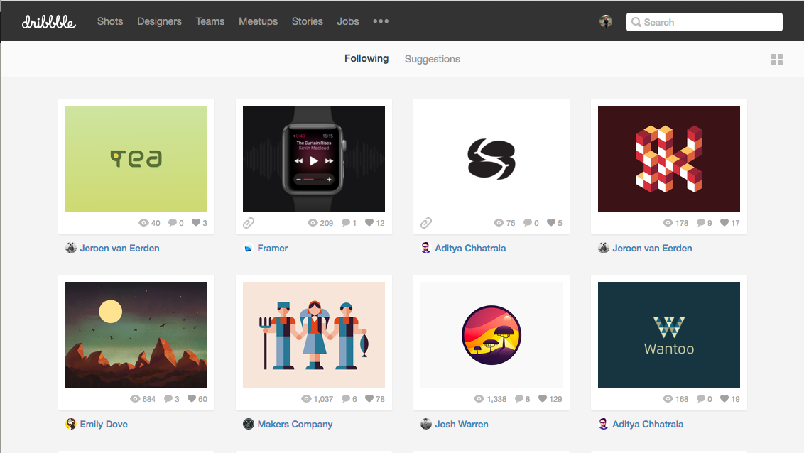
You can select the designs that you like and it shows you the creator, the color palette they used, and more cool designs from that creator.
Adobe Kuler
iPhone App, Android App
The real world is beautiful and because it is something we know, it makes us feel good to see natural colors together. Adobe Kuler allows you to access the hex colors and palette of photos you take. This is a great way to get inspired by your surroundings. Here is an example of two photos that I like, and might want to use as my color scheme on a website:
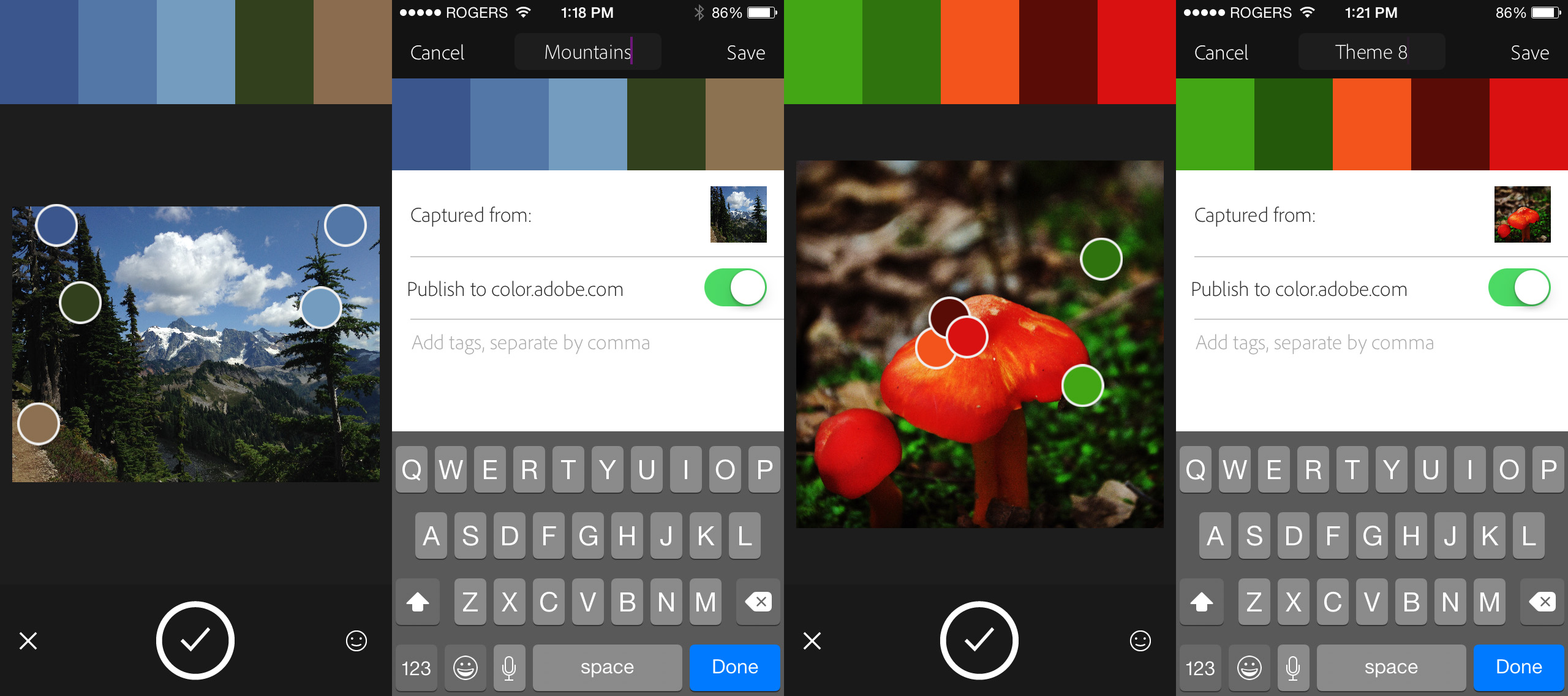
As you can see the Kuler App takes the prominent colors in your photo and creates a color palette for you. You can also change and manipulate the colors to create your perfect palette. I love this app because it lets you take what you like in a photo and use it for the web.
Great Blogs for more resources:
1) Comprehensive reading list for Designers
2) The Best User Experience Design Links of 2014
3) Design+Code
Now that you have a general understanding on what design is and how to get started, lets take a look at some of the specifics of what design is in (Part 2).
comments powered by Disqus